1 Introduction


The data was collected from Gallup World Poll. Their survey consisted of questions that asked participants to rank their own life on a Cantril ladder on a scale from 1 to 10, 10 being the best ideal way of living and 0 being the worst. This data set focuses on the happiness score of each country, which ranges from 0 to 10. Each country is ranked based on that averaged happiness score for participants. The team recorded scores for these factors: economy or GDP per Capita, family or social support, health or life expectancy, and freedom to help explain the happiness score of each country. Also, combining the happiness data set with the Death/ Risk factor and Country Profile data sets will achieve a broader understanding of happiness.


Motivation

  • Quantify an ambiguous concept of happiness for statistical analysis
  • Derive insights on which factors affect happiness on a global scale


Analysis Summary

Descriptive Statistics (All Three Data Sets):

  • Demonstrate the survey results of happiness across the world by using diverse visualizations
  • Observe how happiness scores differ by country and regions
  • Find meaningful correlations among the variables

Regression Analysis:

  • Compare different regression models by visualizing best fit & residual plots
  • Derive insights into the relationship within variables

Cluster Analysis:

  • By using K-means and Hierarchical methods, cluster the data in a continental scope


library(socviz)
library(lubridate)
library(geofacet)
library(ggthemes)
library(ggrepel)
library(ggridges)
library(plyr)
library(skimr)
library(tidyverse)
library(gganimate)
library(plotly)
library(stargazer)  # regression tables
library(ggstatsplot)
library(corrr)
library(moderndive)
theme_set(theme_classic())


2 Data Wrangling


2.1 Happiness Data

# Read 2015 Data
h15 <- read_csv("Happiness_Data/2015.csv")
h15 <- h15 %>%
  dplyr::mutate(Year = 2015) %>%
  dplyr::rename(H_rank=`Happiness Rank`, # Modify variable names
                H_score = `Happiness Score`,
                GDP=`Economy (GDP per Capita)`,
                Health=`Health (Life Expectancy)`,
                Trust=`Trust (Government Corruption)`,
                SE=`Standard Error`,
                dystopia_res = `Dystopia Residual`) 


# Read 2016 Data
h16 <- read_csv("Happiness_Data/2016.csv")  
h16 <- h16 %>%
  dplyr::mutate(Year = 2016,
      `Standard Error` = (`Upper Confidence Interval`-`Lower Confidence Interval`)/3.92) %>%
              # SE = (upper limit – lower limit) / 3.92. 
              # This is for 95% CI
  dplyr::select(-c(`Upper Confidence Interval`,`Lower Confidence Interval`)) %>%
  dplyr::rename(H_rank=`Happiness Rank`, # Modify variable names
                H_score = `Happiness Score`,
                GDP=`Economy (GDP per Capita)`,
                Health=`Health (Life Expectancy)`,
                Trust=`Trust (Government Corruption)`,
                SE=`Standard Error`,
                dystopia_res = `Dystopia Residual`)


# Since we don't have a variable 'Region' starting from 2017, we will create it for 
# each year
h_regions <- dplyr::select(h16, Country, Region)


# Read 2017 Data
h17 <- read_csv("Happiness_Data/2017.csv")  
h17 <- h17 %>%
  dplyr::mutate(Year = 2017,
                `Standard Error` = (`Whisker.high`-`Whisker.low`)/3.92,) %>%
  merge(h_regions,by="Country", all.x=T) %>%
  dplyr::select(-c(`Whisker.high`,`Whisker.low`)) %>%
  dplyr::rename(H_rank=`Happiness.Rank`, # Modify variable names
                H_score = Happiness.Score,
                GDP=Economy..GDP.per.Capita.,
                Health=Health..Life.Expectancy.,
                Trust=Trust..Government.Corruption.,
                SE=`Standard Error`,
                dystopia_res = Dystopia.Residual)


# Read 2018 Data
h18 <- read_csv("Happiness_Data/2018.csv")  
h18 <- h18 %>%
  dplyr::mutate(Year = 2018) %>%
  dplyr::rename(H_rank=`Overall rank`, # Modify variable names
                H_score = `Score`,
                GDP=`GDP per capita`,
                Country = `Country or region`,
                Health=`Healthy life expectancy`,
                Trust=`Perceptions of corruption`,
                Freedom = `Freedom to make life choices`,
                Family = `Social support`) %>%
  merge(h_regions,by="Country", all.x=T) %>%
  dplyr::mutate(dystopia_res = H_score - (GDP + Family + Health + Freedom + Generosity + as.numeric(Trust)))


# Read 2019 Data
h19 <- read_csv("Happiness_Data/2019.csv")  
h19 <- h19 %>%
  dplyr::mutate(Year = 2019) %>%
  dplyr::rename(H_rank=`Overall rank`, # Modify variable names
                H_score = `Score`,
                GDP=`GDP per capita`,
                Country = `Country or region`,
                Health=`Healthy life expectancy`,
                Trust=`Perceptions of corruption`,
                Freedom = `Freedom to make life choices`,
                Family = `Social support`) %>%
  merge(h_regions,by="Country", all.x=T) %>%
  dplyr::mutate(dystopia_res = H_score - 
                  (GDP + Family + Health + Freedom + Generosity + as.numeric(Trust)))

# Combine all data into all_dat
h_alldat <- tibble(rbind.fill(h15,h16,h17,h18,h19))

# Create Continent Variable
h_alldat <- h_alldat %>%
  dplyr::mutate(Country = as.factor(tolower(Country)),
                Region = case_when(
    grepl('central african republic', as.character(Country)) ~ "Middle East and Northern Africa",
    grepl('s.a.r.', as.character(Country)) ~ "Southeastern Asia",
    grepl('lesotho', as.character(Country)) ~ "Sub-Saharan Africa",
    grepl('mozambique', as.character(Country)) ~ "Sub-Saharan Africa",
    grepl('taiwan province', as.character(Country)) ~ "Southeastern Asia",
    grepl('cyprus', as.character(Country)) ~ "Central and Eastern Europe",
    grepl('tobago', as.character(Country)) ~ "Latin America and Caribbean",
    grepl('gambia', as.character(Country)) ~ "Sub-Saharan Africa",
    grepl('macedonia', as.character(Country)) ~ "Central and Eastern Europe",
    grepl('swaziland', as.character(Country)) ~ "Sub-Saharan Africa",
    TRUE ~ Region
    ),
                Continent = case_when(
    grepl('Europe', as.character(Region)) ~ "Europe",
    grepl('Latin', as.character(Region)) ~ "South America",
    grepl('Australia', as.character(Region)) ~ "Oceania",
    grepl('Middle East', as.character(Region)) ~ "Asia",
    grepl('Africa', as.character(Region)) ~ "Africa",
    grepl('Asia', as.character(Region)) ~ "Asia",
    grepl('North America', as.character(Region)) ~ "North America"),
    Region = as.factor(Region))

col_names = colnames(h_alldat)
rmarkdown::paged_table(h_alldat)


Data Descriptions:

  • Variable Names: Country, Region, H_rank, H_score, SE, GDP, Family, Health, Freedom, Trust, Generosity, dystopia_res, Year, Continent

  • Years: 2015 ~ 2019

  • Countries #: 169

  • Regions # : 10


2.2 Death and Risk Factors Data

# Read data in
death_dat <- read_csv('/Volumes/Programming/AndyLeeProjects.github.io/Happiness_Data/number-of-deaths-by-risk-factor.csv')

death_dat <- death_dat %>%
  filter(Year >= 2015) %>%
  rename(Country = Entity) %>%
  mutate(Country = tolower(Country)) %>%
  arrange(Year) %>%
  rename(unsafe_water = `Unsafe water source`,
         unsafe_sanitation = `Unsafe sanitation`,
         alcohol_use = `Alcohol use`,
         drug_use = `Drug use`)

rmarkdown::paged_table(data.frame(colnames(death_dat)))


Data Descriptions: Provides different causes of deaths and risk factors starting from 2015 to 2017


2.3 Country Profile UN Data

country_profile <- read_csv('/Volumes/Programming/AndyLeeProjects.github.io/Happiness_Data/kiva_country_profile_variables.csv')

country_profile <- country_profile %>%
  select(-c(`GDP per capita (current US$)`)) %>%
  dplyr::mutate(country = tolower(country)) %>%
  dplyr::rename(Country = country,
                Life_expectancy = `Life expectancy at birth (females/males, years)`,
                Urban_pop = `Urban population (% of total population)`,
                Phone_subscriptions = `Mobile-cellular subscriptions (per 100 inhabitants)...41`,
                Employment_rate = `Employment: Services (% of employed)`,
                GVA_services = `Economy: Services and other activity (% of GVA)`,
                Infant_mortality = `Infant mortality rate (per 1000 live births`,
                Age_distribution = `Population age distribution (0-14 / 60+ years, %)`,
                Fertility_rate = `Fertility rate, total (live births per woman)`,
                Sanitation_facilities = `Pop. using improved sanitation facilities (urban/rural, %)`,
                Urban_pop_growthrate = `Urban population growth rate (average annual %)`,
                GVA_agriculture = `Economy: Agriculture (% of GVA)`,
                Pop_growthRate = `Population growth rate (average annual %)`,
                Energy_production = `Energy production, primary (Petajoules)`
) %>%
  separate(Life_expectancy, c('Life_expectancy_F','Life_expectancy_M'), sep = "/") %>%
  separate(Age_distribution, c('Age_distribution_below14','Age_distribution_above60'), sep = "/") %>%
  dplyr::select(-c(Region)) %>%
  mutate(Life_expectancy_F = as.numeric(Life_expectancy_F),
         Life_expectancy_M = as.numeric(Life_expectancy_M),
         Life_expectancy_F = case_when(
Life_expectancy_F < quantile(Life_expectancy_F,.66)[[1]] &
Life_expectancy_F > quantile(Life_expectancy_F,.33)[[1]]~ "Medium Life Expectancy",
Life_expectancy_F < quantile(Life_expectancy_F,.33)[[1]] ~ "Low Life Expectancy",
quantile(Life_expectancy_F,.66)[[1]] < Life_expectancy_F ~ "High Life Expectancy"),
         Life_expectancy_M = if_else(Life_expectancy_M < mean(Life_expectancy_M),
                                     "Under Average",
                                     "Above Average"),
         Age_distribution_below14 = as.numeric(Age_distribution_below14),
         Age_distribution_above60 = as.numeric(Age_distribution_above60),
         Infant_mortality_aboveAVG = 
           if_else(Infant_mortality > mean(Infant_mortality),
                   "High Infant Mortality","Low Infant Mortality"),
         Sanitation_facilities_level = 
           if_else(Sanitation_facilities > median(Sanitation_facilities),
                   "Lower Sanitation Level", "Higher Sanitation Level")) # Change the Life_expectancy variables into categorical variables
  
# Display Column names of Country Profile Data
rmarkdown::paged_table(data.frame(colnames(country_profile)))
# Merge: Happiness & Country Infrastructure Data
h_p_dat <- merge(h_alldat, country_profile, by = "Country")
save(h_p_dat, file = '/Volumes/Programming/AndyLeeProjects.github.io/Shiny_Happiness/h_p_dat.RData')

# Merge: Happiness & Death/ Risk factors Data
h_d_dat <- merge(h_alldat, death_dat, by = c("Country","Year"))


Data Descriptions: Provides countries’ profile data including geographic, population, economic, educational, environmental, etc.


3 Happiness Data Analysis


3.1 Column Names


3.2 TOP 10 AVG Hppiness Scores

# Get Top 10 mean of happiness rank from 2015 ~ 2019

top_10 <- h_alldat %>%
  group_by(Country) %>%
  dplyr::summarise(mean_rank = mean(H_rank)) %>%
  arrange(mean_rank) %>%
  filter(mean_rank <= 10)

rmarkdown::paged_table(top_10)


3.3 Boxplot of H_Scores by Regions

ggplot(dplyr::filter(h_alldat, Region != "NA")) +
  geom_boxplot(aes(x = H_score, y=reorder(Region, H_score), color = Region))+
  theme_classic() +
  theme(legend.position = "None") +
  labs(x = "Happiness Scores", y = "Regions")
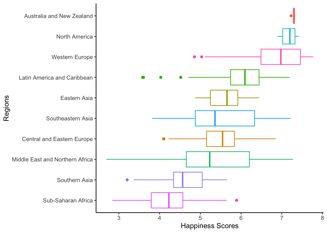


3.4 H_Scores vs GDP

ggplot(dplyr::filter(h_alldat, Region != "NA"), aes(x = GDP, y=H_score, color = Region)) +
  geom_point() +
  theme_classic()+
  labs(title = "Happiness Scores vs GDP by Region\n")


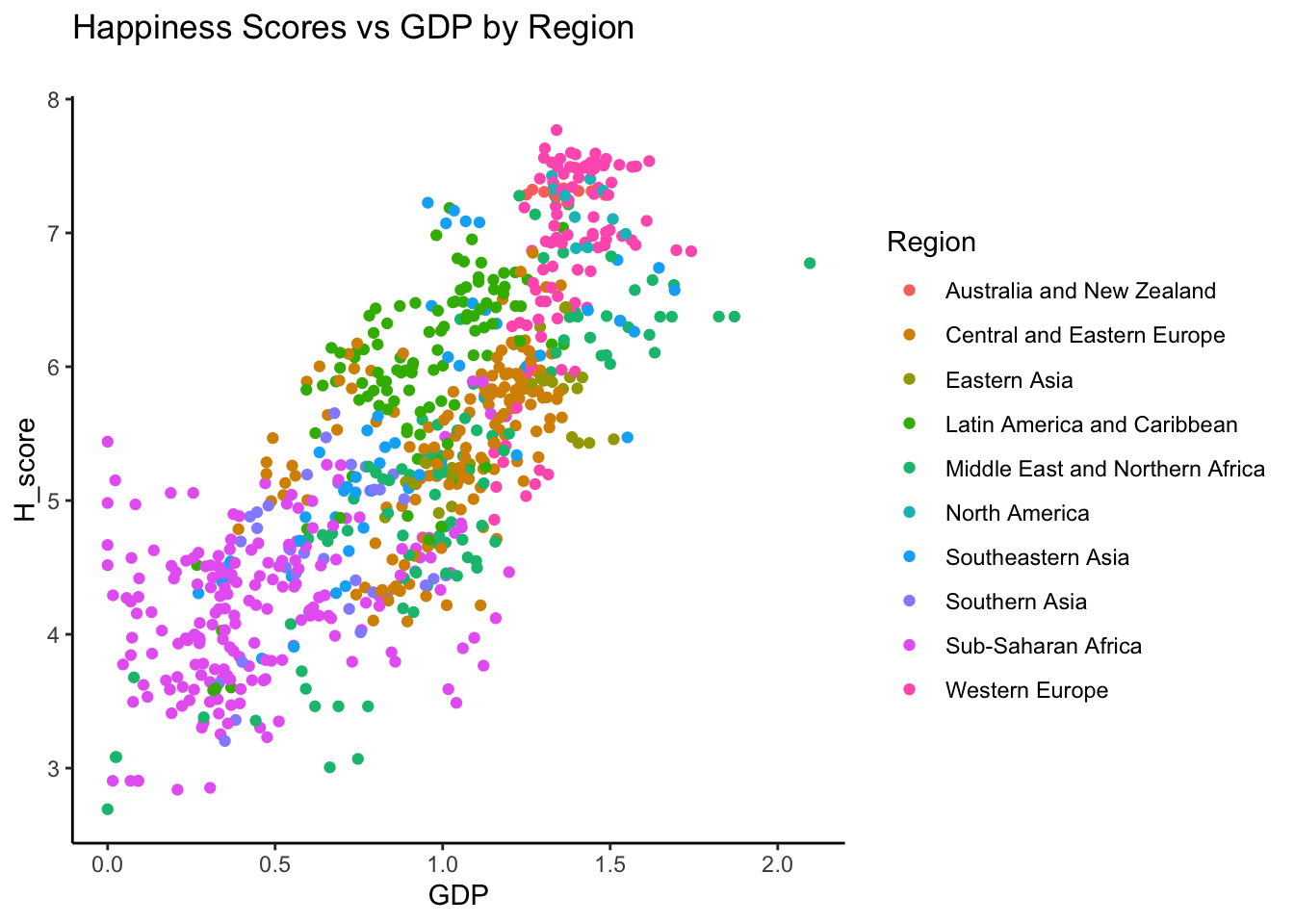
3.5 H_Scores vs GDP: Animation

base <- h_alldat %>%
  plot_ly(x = ~GDP, y = ~H_score, 
          text = ~Country, hoverinfo = "text",
          width = 800, height = 500, size = 2) 

base %>%
  add_markers(color = ~Region, frame = ~Year, ids = ~Country) %>%
  animation_opts(1000, easing = "elastic", redraw = FALSE) %>%
  animation_slider(
    currentvalue = list(prefix = "YEAR ", font = list(color="red"))
  ) 


3.6 World Map by H_Scores

world_map <- map_data("world")
world <- world_map %>%
  dplyr::rename(Country = region) %>%
  dplyr::mutate(Country = str_to_lower(Country),
         Country = ifelse(
            Country == "usa",
            "united states", Country),
         Country = ifelse(
            Country == "democratic republic of the congo",
            "congo (kinshasa)", Country),
         Country = ifelse(
            Country == "republic of congo",
            "congo (brazzaville)", Country),
         Country = as.factor(Country))

h_alldat_world <- left_join(h_alldat, world, by = "Country",all.x=TRUE)

p <- ggplot(h_alldat_world, aes(long, lat, group = group,
                                fill = H_score,
                                frame = Year))+
  geom_polygon(na.rm = TRUE)+
  scale_fill_gradient(low = "white", high = "#FD8104", na.value = NA) +
  theme_map()

p %>%
  plotly::ggplotly() %>%
  animation_opts(1000, easing = "elastic",transition = 0,  redraw = FALSE)


3.7 Regression Model

country_formula <- H_score ~ GDP + Family + Health + Freedom + Generosity
country_model <- lm(country_formula, data = h_alldat)

stargazer(country_model, type = "html", omit = c("Constant"))
Dependent variable:
NA
GDP 1.211***
(0.082)
Family 0.586***
(0.080)
Health 1.005***
(0.133)
Freedom 1.706***
(0.154)
Generosity 0.744***
(0.173)
Observations 782
R2 0.760
Adjusted R2 0.758
Residual Std. Error 0.555 (df = 776)
F Statistic 490.358*** (df = 5; 776)
Note: p<0.1; p<0.05; p<0.01


3.8 Key Corr: GDP & Freedom

colors <- c("Fredom" = "red", "GDP" = "blue")

ggplot(data = h_alldat)+
  geom_smooth(aes(x = Freedom, y = H_score, color = 'Freedom'), method = "lm")+
  geom_point(aes(x = Freedom, y = H_score, color = 'Freedom'), alpha = .3)+
geom_smooth(aes(x = GDP, y = H_score, color = 'GDP',), method = "lm")+
  geom_point(aes(x = GDP, y = H_score, color = 'GDP'), alpha = .3)+
  labs(title = "Noticable Relationships",
       subtitle = "Dataset: Happiness",
       x = "Explanatory Variables")


Analysis Description:

After determining the variables with highest correlations to the happiness score with the regression model, the Freedom & GDP variables were visualized with the H_score variable. As shown above, there are clear linear relationships, which illustrate that GDP and Freedom variables are linearly correlated with the Happiness scores.


4 Happiness & Country Profile Analysis


4.1 Column Names


Find Meaningful Variables related to Happiness Score

Top 10 Positive & Negative Correlation Coefficients

h_p_corr <- data.matrix(h_p_dat, rownames.force = NA) %>%
    correlate() %>% 
    stretch() %>% 
    filter(x != y & x == "H_score" & 
             y != "H_rank" & 
             y != "Net Official Development Assist. received (% of GNI)") %>%
    arrange(desc(r))

# Top 10 Positive Correlation Coefficients
h_p_corr_positive10 <- h_p_corr %>%
  head(10)

# Top 10 Negative Correlation Coefficients
h_p_corr_negative10 <- h_p_corr %>%
  arrange(r) %>%
  head(10)


4.2 Test Correlations

Top 10 Positive Correlation Coefficients

GVA_services: Economic Services and other activity (% of Gross Value Added)
Phone_subscriptions: Mobile-cellular subscriptions (per 100 inhabitants)
Energy_production: Energy production, primary (Petajoules)


Top 10 Negative Correlation Coefficients

GVA_agriculture:Economy Agriculture (% of Gross Value Added)
Sanitation_facilities = Pop. using improved sanitation facilities (urban/rural, %)
Urban_pop_growthrate = Urban population growth rate (average annual %)
Fertility_rate = Fertility rate, total (live births per woman)


4.3 Model 1

formula1 = H_score ~ GDP + Life_expectancy_F
model1 = lm(formula1, data = h_p_dat)

Formula: \(\text{H_score} = b_0 + b_1*\text{GDP} + b_2*\text{Life_expectancy_F} + \epsilon\)

Determine & predict how GDP and Life expectancy for females affect Happiness Scores


ggplot(data = h_p_dat, aes(x = GDP, y = H_score, 
                      color = Life_expectancy_F)) +
  geom_point(aes(col=fct_reorder2(Life_expectancy_F, H_score, GDP)), 
             size = .75, alpha = 0.25) +
  geom_parallel_slopes(se=F)+
  labs(title = "H_Score VS GDP: Female Life Expectancy",
       subtitle = "Parellel Slopes")


Analysis Description:

With the fixed variables GDP and H_score, different levels Life expectancy for females could be compared. As shown, with higher GDP & H_score, it is more likely to achieve higher life expectancy.


4.4 Model 2

formula2 = H_score ~ Life_expectancy_F*GDP
model2 = lm(formula2, data = h_p_dat)

Formula: \(\text{H_score} = b_0 + b_{\text{Life_expectancy_F}}*\text{GDP} + \epsilon\)

Determine & predict how GDP affect Happiness Scores across different life expectancy levels of females


ggplot(data = h_p_dat, aes(x = GDP, y = H_score, 
                      color = Life_expectancy_F )) +
  geom_point(aes(col=fct_reorder2(Life_expectancy_F, H_score, GDP)), 
             size = .75, alpha = 0.25) +
  geom_smooth(method = lm, se=FALSE) +
  labs(title = "H_Score VS GDP: Female Life Expectancy\n")


4.5 Model 3

formula3 = H_score ~ GDP * Sanitation_Level * Life_expectancy_F
model3 = lm(formula3, data = h_p_dat)

Formula: \(\text{H_score} = b_0 + b_{\text{Life_expectancy_F, Sanitation_Level}}*\text{GDP} + \epsilon\)

Determine & predict how GDP affect Happiness Scores across different life expectancy & Sanitation levels


h_p_dat$Sanitation_Level <- factor(h_p_dat$Sanitation_Level,      # Reordering group factor levels
                         levels = c("Lower Sanitation Level",
                                    "Higher Sanitation Level"))

ggplot(data = h_p_dat,
       aes(x = GDP, y = H_score, color = Life_expectancy_F )) +
  geom_point(aes(col=fct_reorder2(Life_expectancy_F, H_score, GDP)), 
             size = .75, alpha = 0.25) +
  geom_smooth(method=lm, se=F) +
  facet_wrap(Sanitation_Level~.)+
  labs(title = "H_Score VS GDP: Female Life Expectancy",
       subtitle = "Levels: Usage of Safe Sanitation Facilities")


Analysis Description:

On top of our analysis of Life expectancy for females, the sanitation factor has been added to observe how sanitation affects the life expectancy across countries with fixed variables, GDP & Happiness scores.

The visualization clearly shows how the sanitation level affects the life expectancy for females. For the higher sanitation level, Low Life Expectancy(in blue) cannot be observed. On the other hand, there exists significant concentration of low life expectancy countries in the lower sanitation level.


4.6 Model Comparisons

stargazer(model1, model2, model3, type = "html", omit = c("Constant"))
Dependent variable:
NA
(1) (2) (3)
GDP 1.556*** 2.673*** 5.051***
(0.207) (0.378) (0.600)
Life_expectancy_FLow Life Expectancy:GDP -1.824***
(0.495)
Life_expectancy_FMedium Life Expectancy:GDP -1.232**
(0.519)
Sanitation_LevelLower Sanitation Level 3.809***
(0.756)
Life_expectancy_FLow Life Expectancy -0.811*** 0.585 -0.496
(0.165) (0.412) (0.445)
Life_expectancy_FMedium Life Expectancy -0.448*** 0.747 4.923***
(0.128) (0.470) (1.089)
GDP:Sanitation_LevelLower Sanitation Level -3.257***
(0.738)
GDP:Life_expectancy_FLow Life Expectancy -0.945*
(0.519)
GDP:Life_expectancy_FMedium Life Expectancy -4.849***
(1.197)
Sanitation_LevelLower Sanitation Level:Life_expectancy_FLow Life Expectancy
Sanitation_LevelLower Sanitation Level:Life_expectancy_FMedium Life Expectancy -5.229***
(1.197)
GDP:Sanitation_LevelLower Sanitation Level:Life_expectancy_FLow Life Expectancy
GDP:Sanitation_LevelLower Sanitation Level:Life_expectancy_FMedium Life Expectancy 4.228***
(1.322)
Observations 210 210 210
R2 0.595 0.621 0.692
Adjusted R2 0.589 0.611 0.678
Residual Std. Error 0.673 (df = 206) 0.655 (df = 204) 0.596 (df = 200)
F Statistic 100.958*** (df = 3; 206) 66.766*** (df = 5; 204) 49.908*** (df = 9; 200)
Note: p<0.1; p<0.05; p<0.01


Comparison Results:

Above table is an organized result of comparing the three models. First, we assume that \(\alpha = 0.05\) and the null hypothesis states that the variables are not correlated. Also, the three stars next to the coefficients demonstrate high correlation.

Now, we can see that as it goes from model 1(far left) to model 3(far right), there are more meaningful variables with high correlations to the H_score variable. Also, we can see that the \(R^2\) is the highest for model 3, which measures how much of the explanatory variables explain the dependent variable(H_score).

From this table, we can derive that the model 3 is the best model. However, let us take a further look at the residual plots to confirm the comparison result.


Residual Plot: Model 1
Formula: H_score ~ GDP + Life_expectancy_F

h_p_dat$pred <- predict(model1, data = h_p_dat)

ggplot(data = h_p_dat, aes(x = pred, y = H_score - pred )) +
  geom_point(alpha = 0.2, color = "red") + geom_smooth(color = "darkblue") +
  geom_line(aes(x = pred, y = 0), color = "red", linetype = 2) +
  xlab("prediction") + ylab("residual error (actual prediction)")

Comment:

The residual plot for model 1 seems to fluctuate, and numerous systematic errors can be observed. From the plot, it is safe to assume that this is not the best model for predicting Happiness Scores.


Residual Plot: Model 2
Formula: H_score ~ Life_expectancy_F * GDP

h_p_dat$pred <- predict(model2, data = h_p_dat)

ggplot(data = h_p_dat, aes(x = pred, y = H_score - pred )) +
  geom_point(alpha = 0.2, color = "red") + geom_smooth(color = "darkblue") +
  geom_line(aes(x = pred, y = 0), color = "red", linetype = 2) +
  xlab("prediction") + ylab("residual error (actual prediction)")

Comment:

Compared to the previous model 1 plot, the curve seems to be smoothed out a bit. However, there still exists systematic errors.


Residual Plot: Model 3
Formula: H_score ~ GDP * Sanitation_Level * Life_expectancy_F

h_p_dat$pred <- predict(model3, data = h_p_dat)

ggplot(data = h_p_dat, aes(x = pred, y = H_score - pred )) +
  geom_point(alpha = 0.2, color = "red") + geom_smooth(color = "darkblue") +
  geom_line(aes(x = pred, y = 0), color = "red", linetype = 2) +
  xlab("prediction") + ylab("residual error (actual prediction)")

Comment:

Lastly, the model 3 demonstrates the best model among them, and certainly confirms the assumption from the comparison table. In other words, the variables GDP, Sanitation Level, and Life Expectancy are not only highly correlated, but has significant affect on the total Happiness Scores. Thus, with the given variables, a reasonable prediction model can be created.

However, it is obvious that model 3 is still far from a perfect model since GDP, Sanitation Levels, and Life expectancy are not the only variables that affect the happiness scores. The next steps would be determining other factors that Happiness Scores tend to depend on.


4.7 Multi Regression using Meaningful Variables

Formula_phone = H_score ~ GDP*Sanitation_Level*Life_expectancy_F + Phone_subscriptions

model_mul <- lm(Formula_phone, data = h_p_dat)
stargazer(model_mul, type = "html", omit = c("Constant"))
Dependent variable:
NA
GDP 1.311***
(0.487)
Sanitation_LevelHigher Sanitation Level -4.043***
(0.759)
Life_expectancy_FLow Life Expectancy -0.576
(0.444)
Life_expectancy_FMedium Life Expectancy -0.475
(0.501)
Phone_subscriptions 0.008**
(0.004)
GDP:Sanitation_LevelHigher Sanitation Level 3.398***
(0.735)
GDP:Life_expectancy_FLow Life Expectancy -0.803
(0.519)
GDP:Life_expectancy_FMedium Life Expectancy -0.393
(0.568)
Sanitation_LevelHigher Sanitation Level:Life_expectancy_FLow Life Expectancy
Sanitation_LevelHigher Sanitation Level:Life_expectancy_FMedium Life Expectancy 5.066***
(1.191)
GDP:Sanitation_LevelHigher Sanitation Level:Life_expectancy_FLow Life Expectancy
GDP:Sanitation_LevelHigher Sanitation Level:Life_expectancy_FMedium Life Expectancy -3.939***
(1.319)
Observations 210
R2 0.698
Adjusted R2 0.683
Residual Std. Error 0.591 (df = 199)
F Statistic 46.062*** (df = 10; 199)
Note: p<0.1; p<0.05; p<0.01


h_p_dat$pred <- predict(model_mul, data = h_p_dat)

ggplot(data = h_p_dat, aes(x = pred, y = H_score - pred )) +
  geom_point(alpha = 0.2, color = "red") + geom_smooth(color = "darkblue") +
  geom_line(aes(x = pred, y = 0), color = "red", linetype = 2) +
  xlab("prediction") + ylab("residual error (actual prediction)")

Phone_subscription variable Added:

Since the number of phone subscription seems to have relatively higher correlation with happiness, it was added to the formula. As shown above, the model’s efficacy has increased.


5 Clustering Analysis


5.1 K-means Method

h_alldat_new <- h_alldat %>%
  select(-SE) %>%
  na.omit()

# Uses all the columns except the first column
vars_to_use <- h_alldat_new %>%
  select(-c(Trust, Region, Continent, Country, Year))

vars_to_use = colnames(vars_to_use)

# Stores the scaling attributes using scale()
# -> Changes to standardized normal distribution for each column
pmatrix <- scale(h_alldat_new[, vars_to_use])
pmatrix

pcenter <- attr(pmatrix, "scaled:center") 
pscale <- attr(pmatrix, "scaled:scale")

H_cluster <- kmeans(na.omit(pmatrix), 3, nstart = 10)
groups <- H_cluster$cluster
h_alldat_c <- cbind(h_alldat_new, cluster = groups)
unique(groups)
ggplot(h_alldat_c)+
  geom_bar(aes(x=cluster, fill = Continent)) + 
  labs(title = "K-Means Clustering", 
       subtitle = "H_Scores across Continents\n")

Bar Graph:

The bar graph illustrates different clusters with given continents; however, this is not a great depiction of the clustering outcome. Thus, let us move on to the next visualization.


# Fix the order of clustering outcome
  # This is because grouping order changes every time the code is ran
orders <- h_alldat_c %>%
  group_by(cluster) %>%
  summarise(n = n())

high_group <- orders %>%
  filter(n == max(n))
mid_group <- orders %>%
  filter(n != max(n) & n != min(n))
low_group <- orders %>%
  filter(n == min(n))

# Reorder the facet_grid
h_alldat_c$cluster_f <- factor(h_alldat_c$cluster, levels=c(as.integer(low_group['cluster']),
                                                           as.integer(high_group['cluster']),
                                                           as.integer(mid_group['cluster'])))

# Plot
ggplot(h_alldat_c) +
  geom_point(aes(x = GDP, 
                 y = H_score, color = Continent)) +
  facet_grid(cluster_f ~ Continent, scales = "free_y") +
  theme(legend.position = "None") +
  labs(title = "K-Means Clustering", 
       subtitle = "Happiness Disparity within Continents")

Comment:

This visualization best demonstrates the K-means clustering result among the continents. As shown above, the first row consists of the group with relatively higher Happiness scores and GDP, where it includes countries from North America and Oceania. On the other hand, when looking at the last row, it consists most of the countries from Africa. Therefore, this clustering method provides a broader understanding of the disparity of happiness within and among the continents.

Next, let us take a look at hierarchical clustering method, which will confirm the results found in K-means clustering.


5.2 Hierarchical Method

h_alldat_new <- data.frame(h_alldat %>%
  select(Continent, everything(), -c(Trust, Country, Region)) %>%
  group_by(Continent) %>%
  dplyr::summarise(H_score_mean = mean(H_score),
            H_rank_mean = mean(H_rank)) %>%
  na.omit())
numbers_only <- h_alldat_new[,-1]
rownames(numbers_only) <- h_alldat_new[,1]
# Applying Ward Hierarchical Clustering
d <- dist(numbers_only, method="euclidean")


Hierarchical Clustering: Complete Method

fit <- hclust(d, method="complete")
plot(fit, xlab = "Continents", y = "H_Scores Cluster Groups")


Hierarchical Clustering: Ward Method

fit <- hclust(d, method="ward")
plot(fit, xlab = "Continents", y = "H_Scores Cluster Groups")


6 Conclusion


We have utilized various statistical models to analyze the happiness data set and find insights on happiness in a global scale. Through Regression Analysis, we have predicted and tested using various models. Also, meaningful relationships, such as GDP & Life Expectancy, could be observed by testing the sensitivities with sanitation levels. Regression was adequate for the Happiness Data since it allowed to find correlations and create prediction models related to happiness scores.

Next, we have performed clustering analysis, which provided a bigger picture by diving the data set into meaningful clusters within continents. Most importantly, clustering analysis generated more important questions that will lead to further studies of determining which factors causes the disparity the most. Thus, search for happiness is not over. It has just begun. With these findings, I am looking forward to a more in-depth research about happiness.