Project
Description
Towards the end of my military service, I tried to
find ways to maintain a high-disciplinary lifestyle even after my
release. After much contemplation, I decided to develop a grading system
for my day-to-day life, which sprouted from the concept of math exams.
The graded exams allow us to improve our mathematical knowledge by
analyzing our weaknesses and strengths. Thus, by utilizing quantifiable
variables that best represent the fullness of my lifestyle and by
implementing various mathematical models, I was able to construct an
effective grading system for my day-to-day life.
The self-evaluation project comprises three main procedures:
collecting meaningful data, applying statistical analysis, and
visualizing indicative findings in daily life. The goal is to find
numerous insights and unique patterns with over 500 days’ worth of data
using R. Also, a more comprehensive understanding of the lifestyle will
be obtained by utilizing advanced statistical concepts such as linear
regressions and various correlation tests. Ultimately, these findings
will provide better guidance for me to achieve healthier life patterns
in the future.
library(lubridate)
library(gridExtra)
library(margins)
library(psych)
library(grid)
library(forecast)
library(papeR)
library(tidyverse)
library(reticulate)
py_install("pandas")
py_install("numpy")
py_install("statsmodels")
py_install("matplotlib")
theme_set(theme_classic())
Main Variables:
Descriptive Statistics
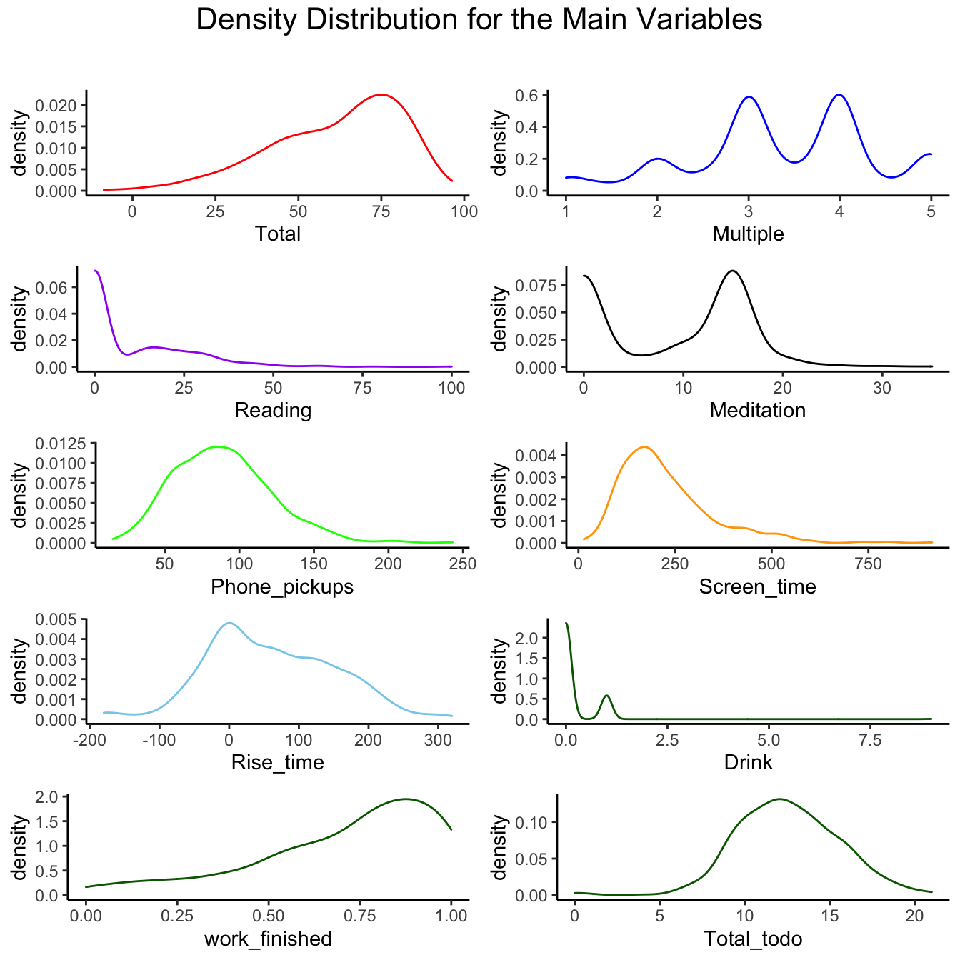
Main Varibles
Descriptions
- Reading: reading duration in
minutes
- Meditation: meditation duration in
minutes
- Phone_pickups: number of times I
picked up my phone
- Screen_time: duration of spent time
on my phone in minutes
- Rise_time: the variation in minutes
from the intended rise time
- 0: Woke up on time
- -n: Woke up n minutes earlier than intended
- +n: Woke up n minutes later than intended
Drink: Whether or not I drank the
day before (Boolean)
Work_finished: Finished_tasks /
Total_tasks
Multiple: Subjective grade given
each day
- Considered factors: Mentality, Satisfaction, Productivity, Social
interaction, and Tech consumption
Total: The sum of the percentages
calculated of above variables
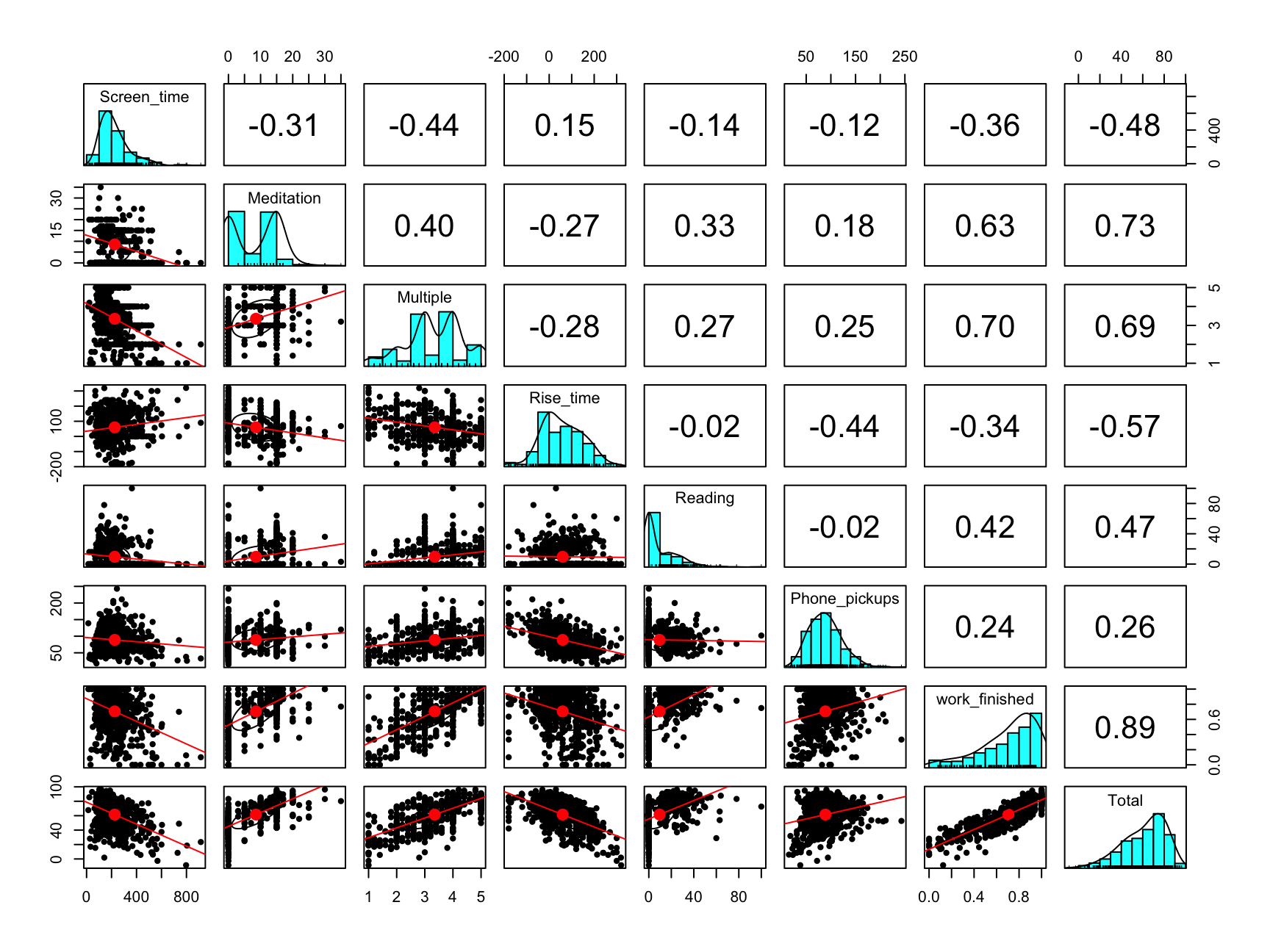
Main Variables
Correlations
To find the relationships between these variables and
how they affect my lifestyle, we will first observe the relationships
within variables
- Use pairs.panels function in psych
module
- The diagonal histograms demonstrates the
distribution of each variable
- The bottom left triangle represents a scatter plot
with the best fit line
- The top right triangle represents a correlation
coefficient for each pair, which ranges from -1 to 1
- If the coefficient is close to 1, it means that the pair holds a
positive relationship and a negative relationship for -1.
- Correlation Coefficient Formula:
\[r =
\dfrac{\sum(x_i-\bar{x})(y_i-\bar{y})}{\sqrt{\sum(x_i-\bar{x})^2\sum(y_i-\bar{y})^2}}\]
correlation_plot <- all_dat %>%
  select(c(Screen_time, Meditation, Multiple, Rise_time,
           Reading,Phone_pickups, work_finished, Total))

pairs.panels(correlation_plot, lm = TRUE)
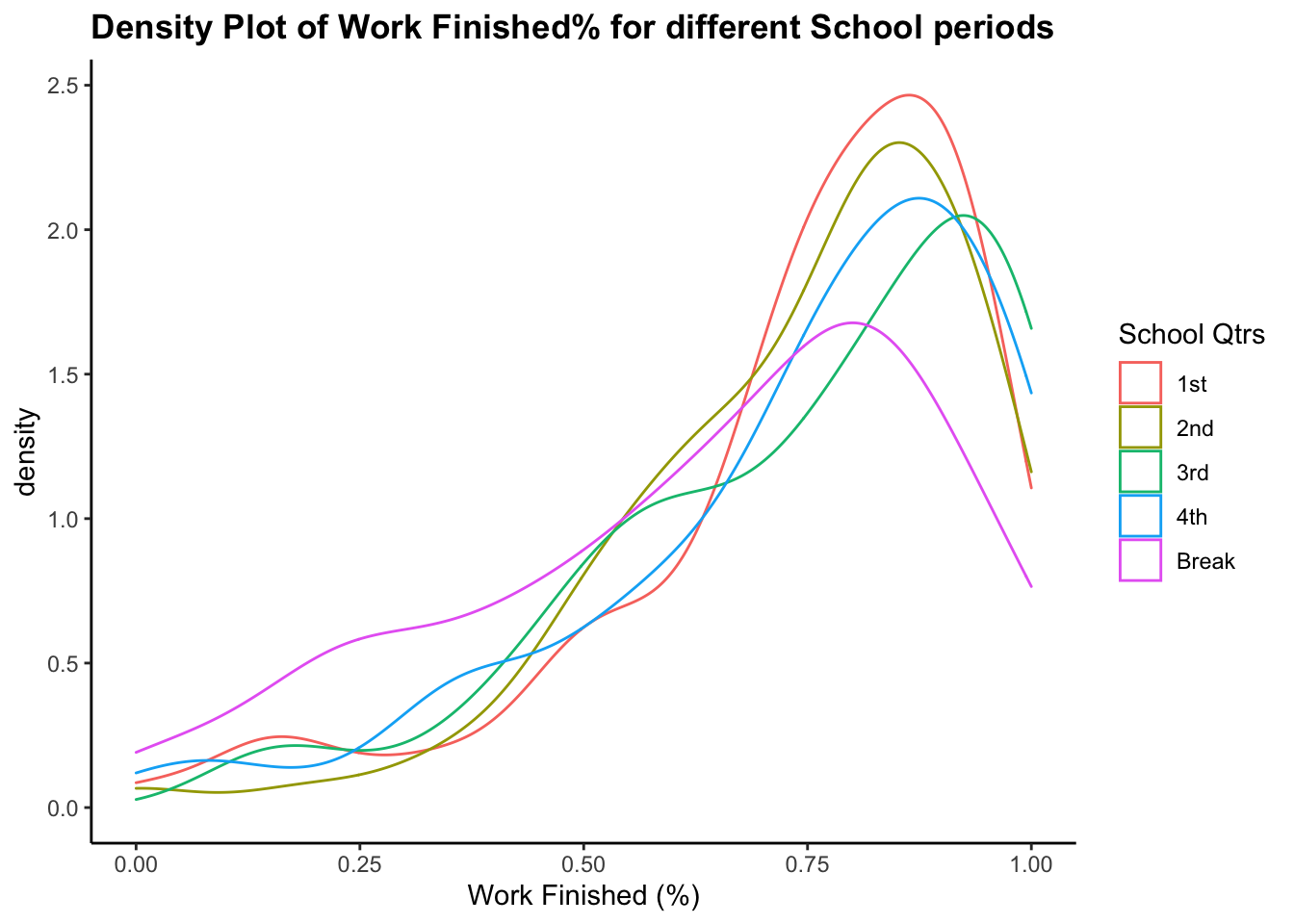
School Variable
ggplot(data = filter(all_dat, School != FALSE), aes(x = work_finished,
                           color = School))+
  geom_density()+
  labs(title = "Density Plot of Work Finished% for different School periods",
       x = "Work Finished (%)")+
  theme(plot.title = element_text(face = "bold")) +
  scale_color_discrete(name = "School Qtrs")
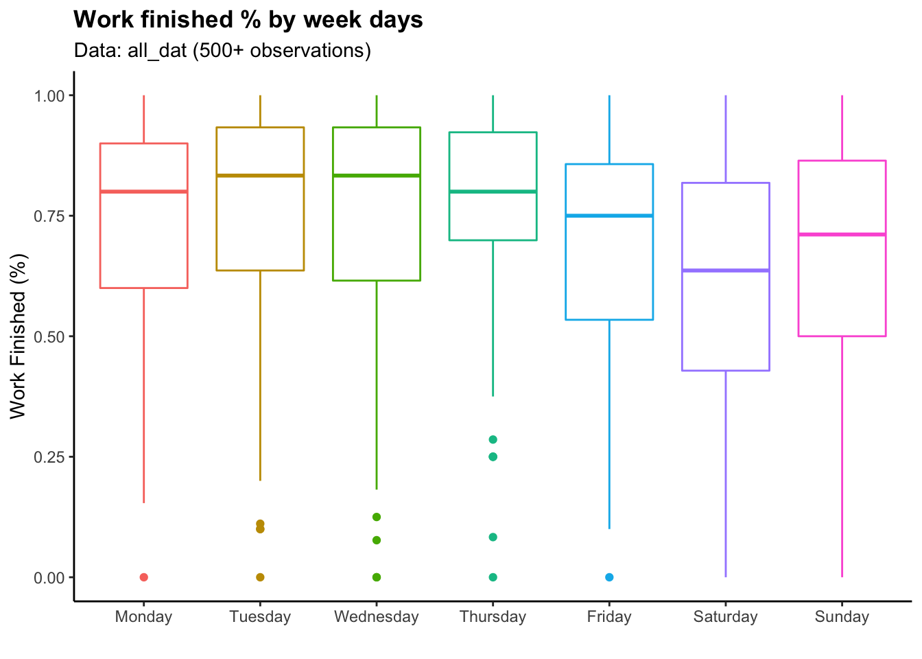
Weekday Variable
all_dat$Weekdays <- factor(all_dat$Weekdays,levels = c("Monday", "Tuesday", "Wednesday", "Thursday","Friday","Saturday","Sunday"))

ggplot(data = all_dat)+
  geom_boxplot(aes(x = Weekdays,
                   y = work_finished, color = Weekdays))+
  theme(legend.position = "None")+
  labs(title = "Work finished % by week days",
       subtitle = "Data: all_dat (500+ observations)",
       x = "", y = "Work Finished (%)")+
  theme(plot.title = element_text(face = "bold"))
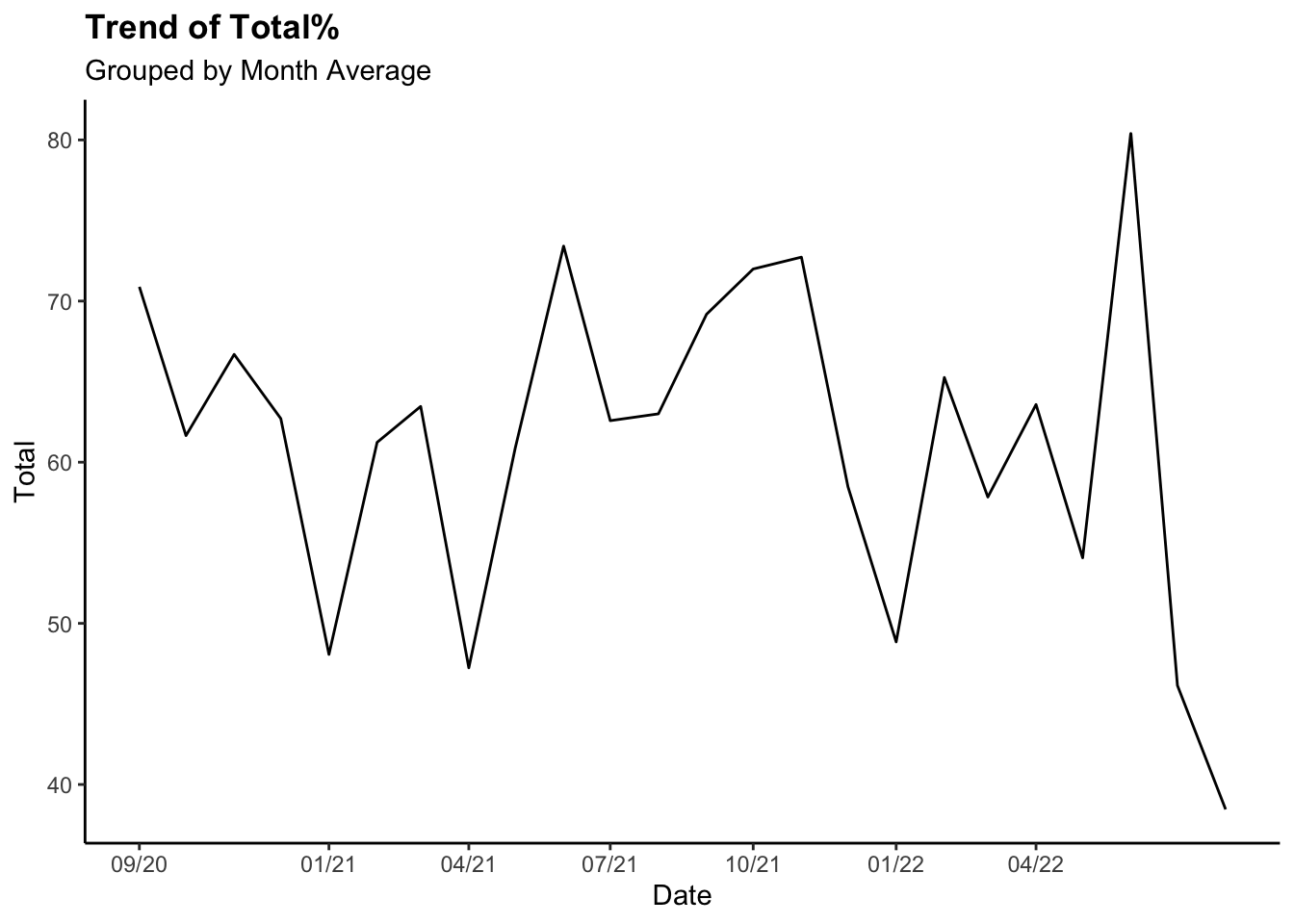
Time Trend (Total
%)
all_dat_month <- all_dat %>%
  filter(!is.na(Rise_time)) %>%
  group_by(year, month) %>%
  dplyr::summarise(Total = mean(Total),
            Rise_time = mean(Rise_time)) %>%
  mutate(Date = make_date(year, month)) %>%
  arrange(Date)


ggplot(all_dat_month)+
  geom_line(aes(x=Date, y=Total))+
  labs(title = "Trend of Total%",
              subtitle = "Grouped by Month Average")+
  theme(plot.title = element_text(face = "bold")) +
  scale_x_continuous(breaks = ymd("2020-09-01", "2021-01-01","2021-04-01", "2021-07-01", "2021-10-01","2022-01-01", "2022-04-01"),
                     labels=c("09/20", "01/21", "04/21", "07/21",
                                "10/21", "01/22","04/22"))
Time Trend (Total % -
Rise time)
ggplot(all_dat_month)+
  geom_line(aes(x=Date, y=Total-Rise_time))+
  labs(title = "Trend of Total% - Rise time",
              subtitle = "Larger positive differnce indicates higher productivity")+
  theme(plot.title = element_text(face = "bold")) +
  scale_x_continuous(breaks = ymd("2020-09-01", "2021-01-01", "2021-06-01",
                                "2022-01-01"))
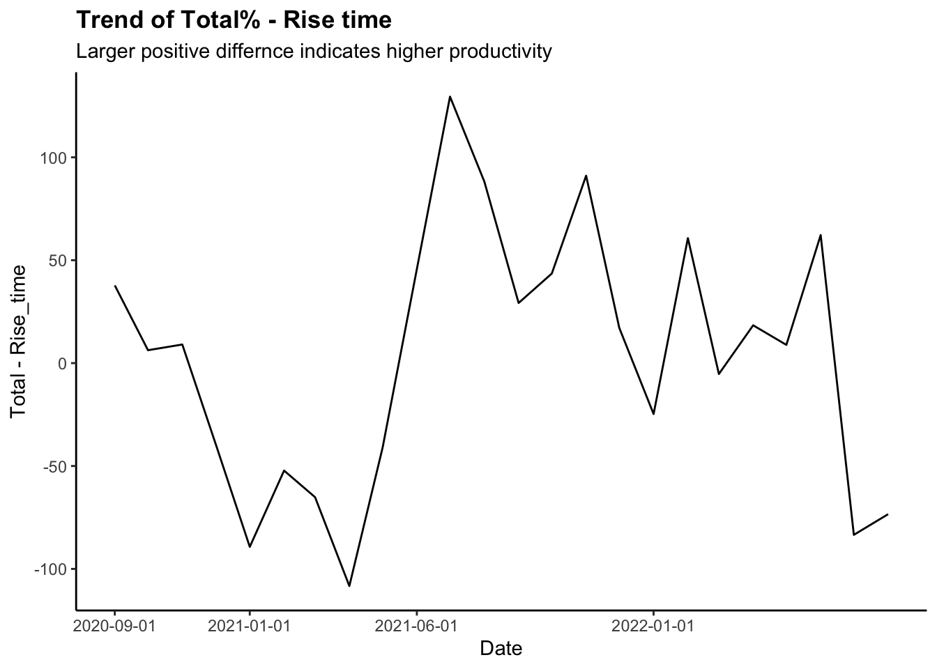
- Note for Rise time:
- 0: Woke up on intended time
- Positive value: Later than intended
- Negative value: Earlier than intended
Main Variables: Linear
Regressions
Simple Linear
Regression
- Set:
- x = Explanatory Variable
- y = Dependent Variable
- \(\alpha\) = y-intercept
- \(\beta\) = slope
lm() function:Fitting Linear Models
- Finds fitted line(\(\alpha\) &
\(\beta\)) by using the least-square
method
- Least-square: by summing up the residual squares
for different curves, it finds the “least squared” curve that best fit
the data.
- Outputs \(R^2\), p-value and other
meaningful calculations
- \(R^2\): It demonstrates how
accurate the fitted line is to the data
- Formula: \(R^2
=1-\dfrac{Var(fit)}{Var(mean)}\) or \(1-\dfrac{RSS}{TSS}\)
- Ex: If we get.8, it means that \(x\) explains 60% of the variation in \(y\)
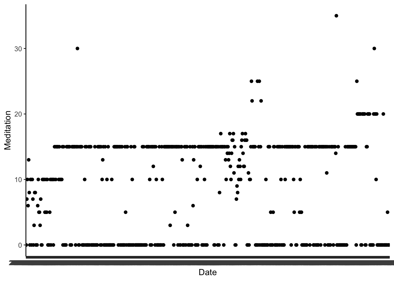
Handle
Outliers
quartiles <- quantile(all_dat$Meditation, probs=c(.25, .75), na.rm = TRUE)
IQR <- IQR(all_dat$Meditation)

Lower <- quartiles[1] - 1.5*IQR
Upper <- quartiles[2] + 1.5*IQR

data_no_outlier <- subset(all_dat, all_dat$Meditation > Lower & all_dat$Meditation < Upper)


ggplot(data = data_no_outlier) +
  geom_point(aes(x = Date, y = Meditation))
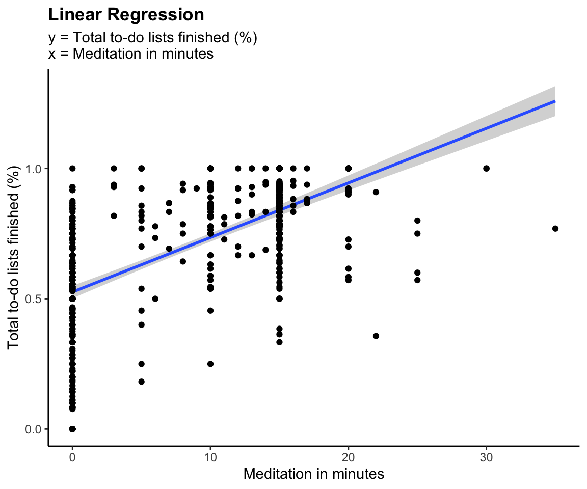
model <- lm(work_finished ~ Meditation, data = all_dat)
pretty_lm <- prettify(summary(model))
rmarkdown::paged_table(pretty_lm)
ggplot(all_dat,aes(x=Meditation, y=work_finished))+
  geom_smooth(method = "lm")+
  geom_point()+
  labs(title = "Linear Regression",
       subtitle = "y = Total to-do lists finished (%) \nx = Meditation in minutes",
       y = "Total to-do lists finished (%)", x = "Meditation in minutes")+
  theme(plot.title = element_text(face = "bold"))
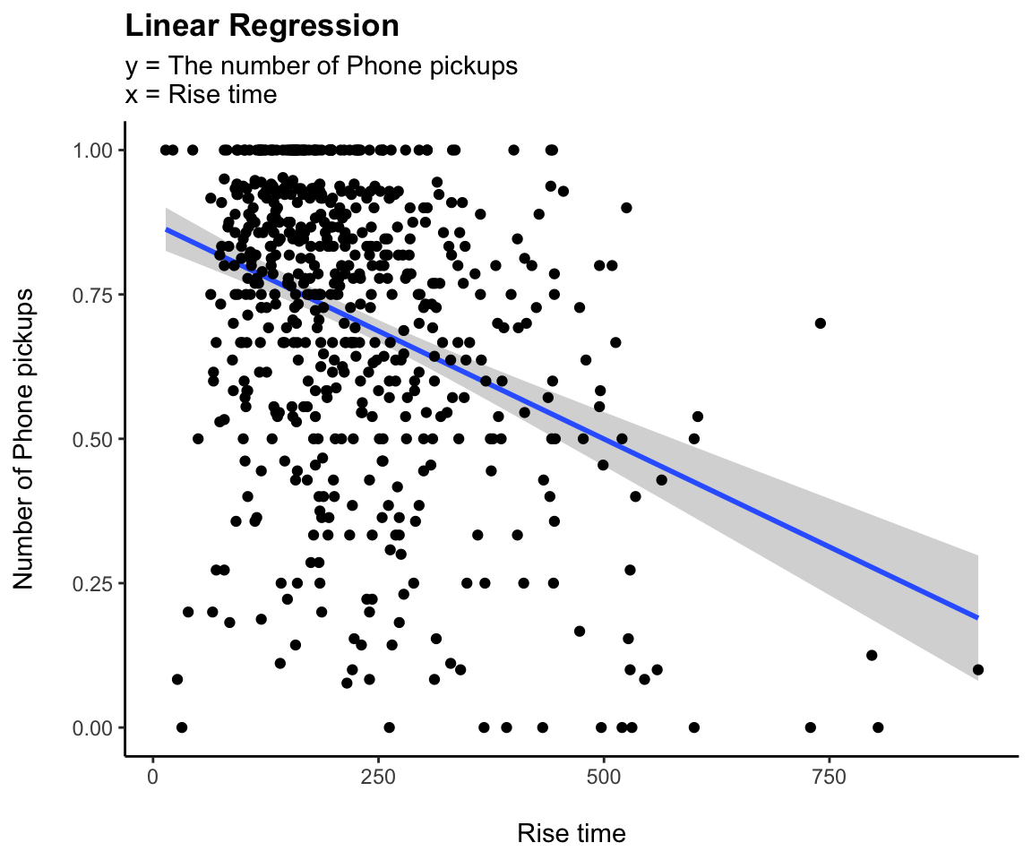
model <- lm(work_finished ~ Screen_time, data = all_dat)
pretty_lm <- prettify(summary(model))
rmarkdown::paged_table(pretty_lm)
ggplot(all_dat,aes(x=Screen_time, y=work_finished))+
  geom_smooth(method = "lm")+
  geom_point()+
  labs(title = "Linear Regression",
       subtitle = "y = The number of Phone pickups\nx = Rise time",
       y = "Number of Phone pickups\n", x = "\nRise time")+
  theme(plot.title = element_text(face = "bold"))
Multiple
regressions
- Set:
- y = Dependent Variable
- \(x_1,...x_n\) = n
independent/explanatory variables
- \(\alpha\) = Constant or
intercept
- \(\beta\) = weights for each \(x_1,...x_n\)
model <- lm(work_finished ~ Screen_time + Meditation + Rise_time + Phone_pickups +
              Reading + Drink + Total_todo + Social,  data = all_dat)

pretty_lm <- prettify(summary(model))
rmarkdown::paged_table(pretty_lm)
Actual vs Prediction
Visualization for Work_done (all_dat)
all_dat$pred_work_finished <- predict(model, newdata = all_dat)

# Explanatory variable: work_finished
ggplot(data = all_dat, aes(x = pred_work_finished, y = work_finished)) +
  geom_point(alpha = 0.5, color = "darkgray") +
  geom_smooth(color = "darkblue") +
  geom_line(aes(x = work_finished,
                y = work_finished),   # Plotting the line, y = x
            color = "red", linetype = 2) +
  coord_cartesian( xlim = c(0, 1),
                   ylim = c(0, 1) ) +  # Limits the range of the
  labs(title = "Multiple Regression",
       subtitle = "Actual Tasks Finished (%) vs Predicted Values of Task Finished (%)",
       y = "Tasks Finshed (y)", x = expression(hat(y)))+
  theme(plot.title = element_text(face = "bold"))
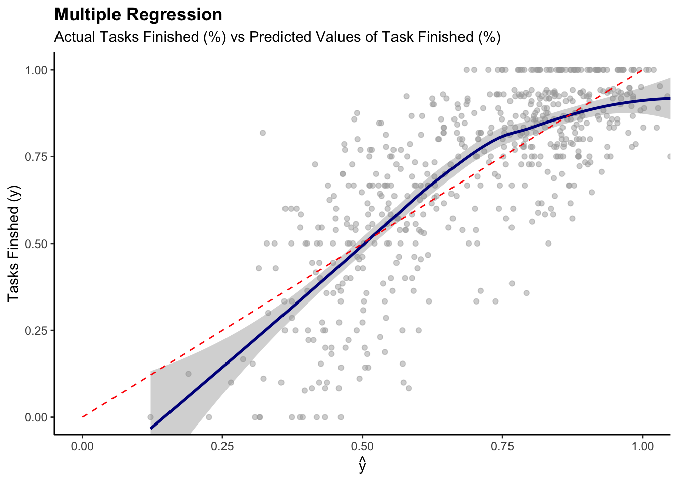
- Systematic Error can be observed
- NOT a perfect prediction model, but the the model is reasonably
accurate
Main Variables: Time
Series
ats <- ts(all_dat, start = decimal_date(ymd("2020-09-01")),
                            frequency = 365.25 / 7)

ggplot(data = all_dat) +
  geom_line(aes(x = ymd(Date), y = Total))+
  geom_smooth(aes(x = ymd(Date), y = Total, color = "red")) +
  scale_x_continuous(breaks = ymd("2020-09-01", "2021-01-01","2021-04-01", "2021-07-01", "2021-10-01","2022-01-01", "2022-04-01"),
                     labels=c("09/20", "01/21", "04/21", "07/21",
                                "10/21", "01/22","04/22"))+
  labs(title = "Time Seires", subtitle = "Total (%)")
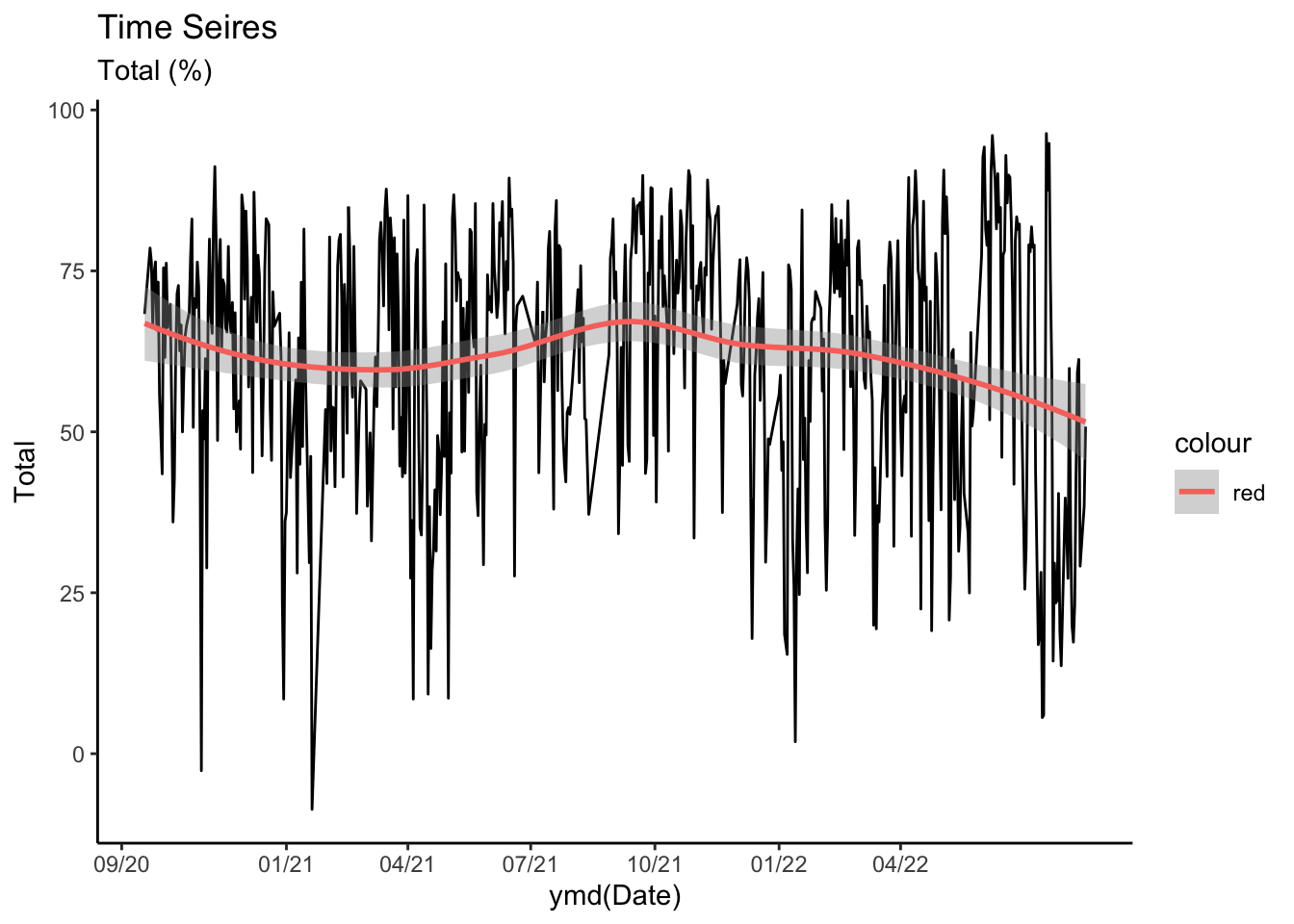
theme(legend.position = "None")
## List of 1
##  $ legend.position: chr "None"
##  - attr(*, "class")= chr [1:2] "theme" "gg"
##  - attr(*, "complete")= logi FALSE
##  - attr(*, "validate")= logi TRUE
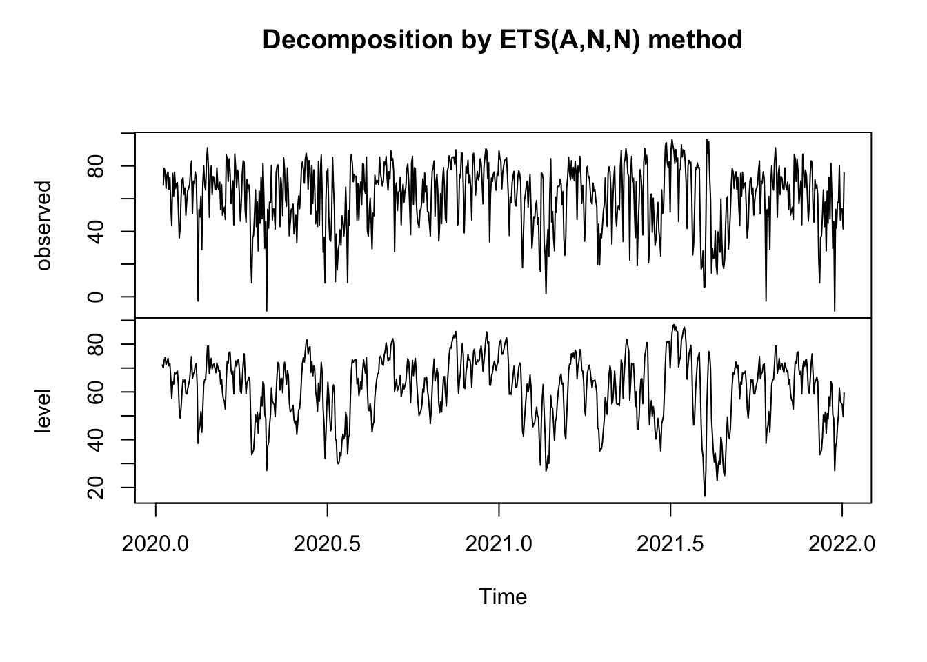
myts <- ts(all_dat$Total, start=c(2020, 9,1), end=c(2022, 3, 31), frequency=365)
fit = ets(myts)
plot(fit)
Test
Stationarity
import numpy as np
import pandas as pd
import statsmodels.api as sm
import matplotlib.pyplot as plt
from matplotlib.dates import DateFormatter
import matplotlib.dates as mdates
all_dat = r.all_dat
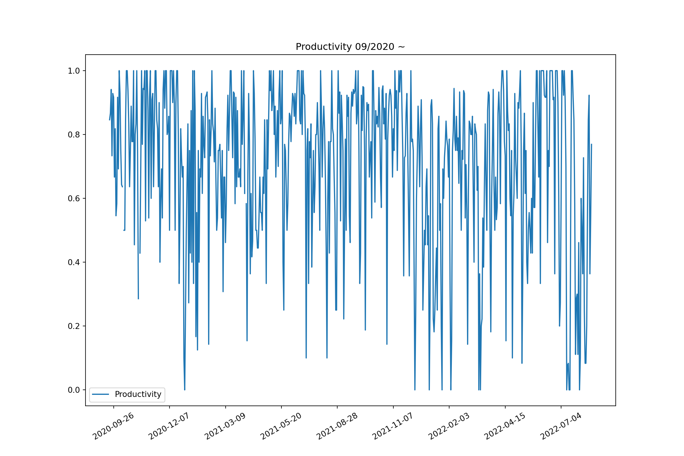
fig, ax = plt.subplots(figsize=(12, 8))
ax.plot(all_dat['Date'], all_dat['work_finished'], label = "Productivity")
ax.legend(loc='best')
ax.xaxis.set_major_locator(mdates.WeekdayLocator(interval=10))
plt.xticks(rotation = 30)
## (array([ 5., 75., 145., 215., 285., 355., 425., 495., 565.]), [Text(0, 0, ''), Text(0, 0, ''), Text(0, 0, ''), Text(0, 0, ''), Text(0, 0, ''), Text(0, 0, ''), Text(0, 0, ''), Text(0, 0, ''), Text(0, 0, '')])
ax.set_title("Productivity 09/2020 ~")
plt.show()
# https://www.machinelearningplus.com/time-series/augmented-dickey-fuller-test/
from statsmodels.tsa.stattools import adfuller
def adf_test(timeseries):
    print ('Results of Dickey-Fuller Test:')
    dftest = adfuller(timeseries, autolag='AIC')
    dfoutput = pd.Series(dftest[0:4], index=['Test Statistic','p-value','#Lags Used','Number of Observations Used'])
    for key,value in dftest[4].items():
        dfoutput['Critical Value (%s)'%key] = value
    print (dfoutput)

timeseries = all_dat['work_finished'].dropna()
adf_test(timeseries)
## Results of Dickey-Fuller Test:
## Test Statistic                  -4.210956
## p-value                          0.000631
## #Lags Used                      11.000000
## Number of Observations Used    589.000000
## Critical Value (1%)             -3.441501
## Critical Value (5%)             -2.866460
## Critical Value (10%)            -2.569390
## dtype: float64
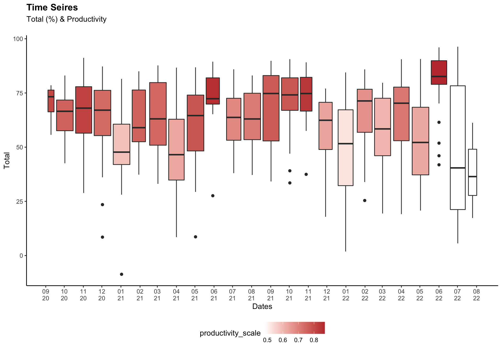
box_dat <- all_dat %>%
  group_by(month) %>%
  mutate(my = make_date(year, month)) %>%
  filter(!is.na(work_finished)) %>%
  group_by(my) %>%
  mutate(productivity_scale = mean(work_finished))

# Total months
tot_month = length(unique(box_dat$my))

dates = seq(as.Date('2020-09-15', format = "%Y-%m-%d"),
            by = "month", length.out = tot_month)
dates_lb = format(seq(as.Date('2020-09-01', format = "%Y-%m-%d"),
                      by = "month", length.out = tot_month), "%m\n%y")

ggplot(box_dat) +
  geom_boxplot(aes(x = ymd(Date), y = Total,
                   fill = productivity_scale, group = my))+
  labs(title = "Time Seires", subtitle = "Total (%) & Productivity\n", x = "Dates") +

  scale_x_date(breaks = dates, labels = dates_lb)+
  scale_fill_gradient(low = "white", high = "#C03B3B")+
  theme(plot.title = element_text(face = "bold"), legend.position = "bottom")